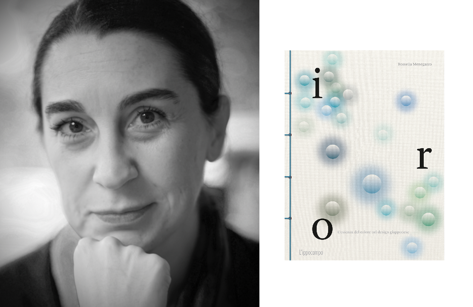
A history, a country, a culture still to be discovered (and rediscovered): when we think of Japan, we think of a place full of treasures capable of exciting us again and even more, despite its culture is editorially underestimated, especially for certain aspects and pillars of history and society still little or not at all explored in western-language publications. Among these, are design and color, whose understanding is completely different compared to the western one, as well as Japanese sensitivity towards the same.
“Iro. The essence of colour in Japanese design” talks about this: design, artisanal production, and traditional color in Japanese land. We have interviewed Rossella Menegazzo, associate professor of East Asian Art History at the University of Milan and author of a volume full of information on the traditional colors of Japan and their symbolic value, a bridge between history, culture, design, fashion, nature and spiritualism.
But can a culture still get in touch with nature, when society gets more and more infertile?
In a book that focuses on a culture where the unsaid and intangible are worth more than a thousand words, the author chooses to represent the two faces of the Japanese medal: absence and abundance, in the culture as well in nature.
After co-writing “WA. L’essenza del design giapponese”, what made you want to dig deeper into the link between design and color in Japanese culture?
The idea to furtherly develop the research on design through color came to me and my colleagues from Phaidon because the conception and sensitivity to color in Japan are totally different from the Western ones in general, they were born and developed in a cultural environment that has nothing to do with our values and these aspects are still little explored or unexplored in Western published works with a strong impact on the production of design and craftsmanship.
How did the writing process develop? Which sources and inspirations were the most useful to you?
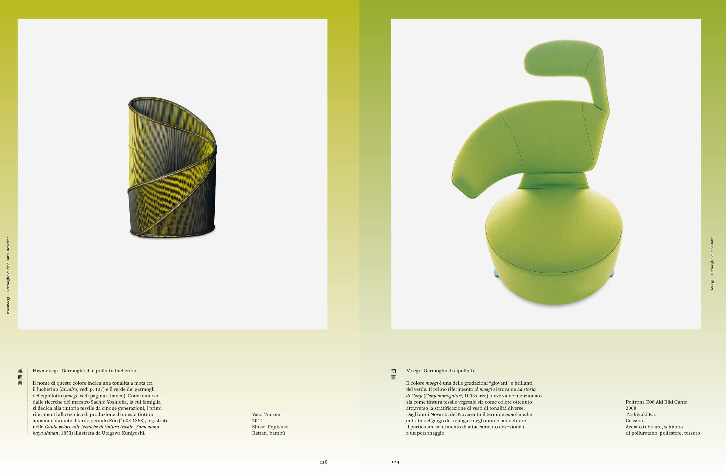
It’s a volume with brief texts but rich in information that ranges from design and craftmanship on one hand – designer/artisans, products, material – to traditional color on the other hand – the story and evolution of each color, the literal translation of names referring to their genesis and the imagery of each color, and so on. The research’s been vast and based on the whole existing Japanese bibliography on the theme of traditional colors, besides the very wide iconographic research for the choice of the products to propose for each color. A great source of inspiration for me was maestro Yoshioka, a textile dyer and expert of color from Kyoto who unfortunately died in 2019, while this volume was in the process of being created.
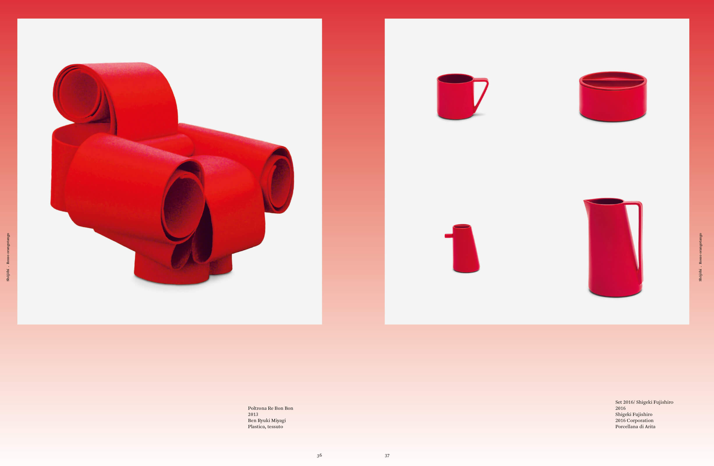
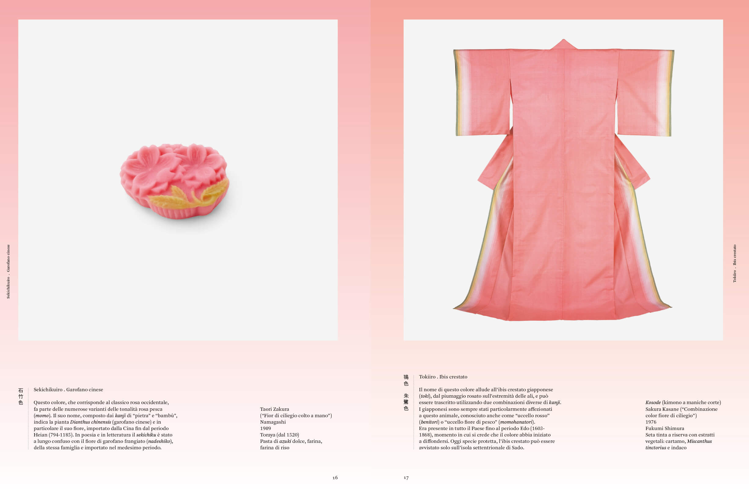
The traditional Japanese colors are filled with symbolic value linking history, culture, design, fashion, nature, and spiritualism: in which way has such a rich and symbolic relationship developed over time? And how is it different nowadays?
The book does answer this question, it’s impossible to say in just a few words. In my introductory essay, I wrote that trying to explain and cage traditional Japanese colors in strict definitions is like hunting ghosts… because in Japanese culture, the unspoken is worth more than the spoken, and this also goes for color, which always gives an indefinite idea of its essence, which leaves space for personal interpretation. Many are inspired by nature, but over time they’ve changed because each era has a different experience of nature, and consequently also of color, from which trends originate…
The aim to represent, through this volume, the two cultural souls of Japan, absence and abundance, is very interesting: how would you want readers to absorb these two concepts?
It’s a double track, a double soul that Japan offers to individual experience, but it’s obviously also a simplified division of a much more complex reality. Of course, if we consider how Japanese culture has been and keeps being fascinating to us, on one hand, we can find products with features linked to simplicity, monochrome, and essentiality, on the other hand, products that represent polychrome, and abundance that sometimes borders on the kitsch. Japanese design more generally follows the line of monochrome and simplicity of shapes, the manufactory production, especially the textile one, derives from the experience of color.
Nature is certainly the protagonist of your book, also in terms of the preparation of tinctures (for example, I’m thinking of the various shades of red): do you believe that it’s still possible to “feel” the contact with nature within a society like today’s one, that’s so intense and fast?
Japan is a controversial country in terms of the experience of nature. Poetry, literature, art, and colors originate from a deep sensibility toward the mutations of nature which even dictate law in certain eras’ fashion; on the other hand, today’s Japan overbuilds and demolishes even secular or symbolic plants in favor of urbanization following the economy. I believe that younger generations have lost so much knowledge in the field of tradition, and therefore transmitting meanings and habits, just like the contact with nature is extra limited also in their time off. However, I like to look at those young designers/artisans/artists who work transversally, in all fields, resuming classic techniques and materials to transform them into products that fit today’s times in small laboratories.
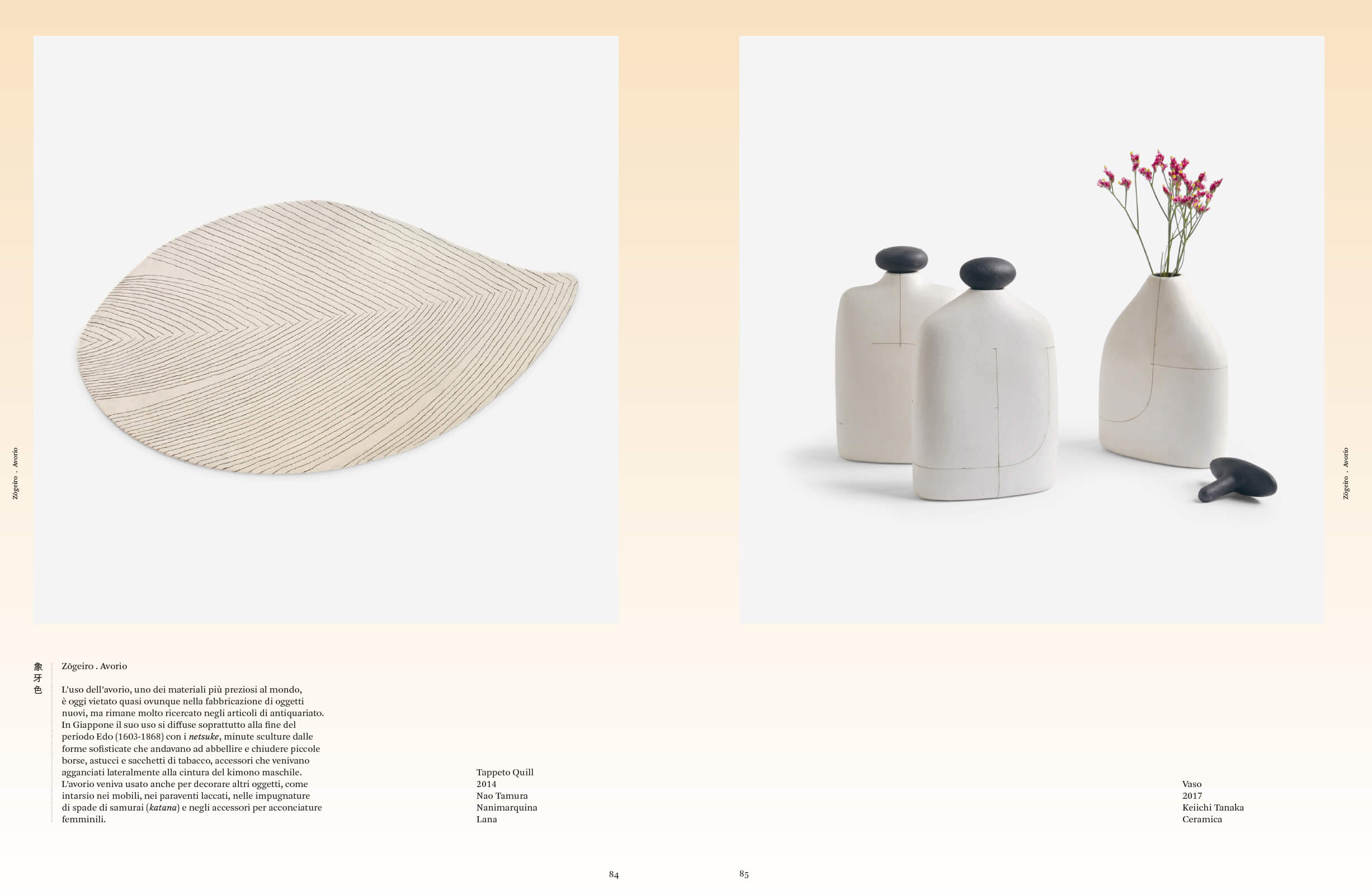
“Japanese design more generally follows the line of monochrome and simplicity of shapes, the manufactory production, especially the textile one, derives from the experience of color.”
Which of the anecdotes discovered during your research, inherent to the inspiration of color in Japanese design was more interesting and unexpected to discover?
I’d say that the name of each color opened up fantastic doors into the world of nature, plants, stones, and birds’ feathers, but also trends, from theater to the tea ceremony, and so many idioms… I hope it’s something the readers will enjoy, too! For this reason, when translating the names of colors, I tried to be faithful to the meaning of the Chinese characters they’re made of.
If you had to choose, what’s the color and the design object that best represents Japan?
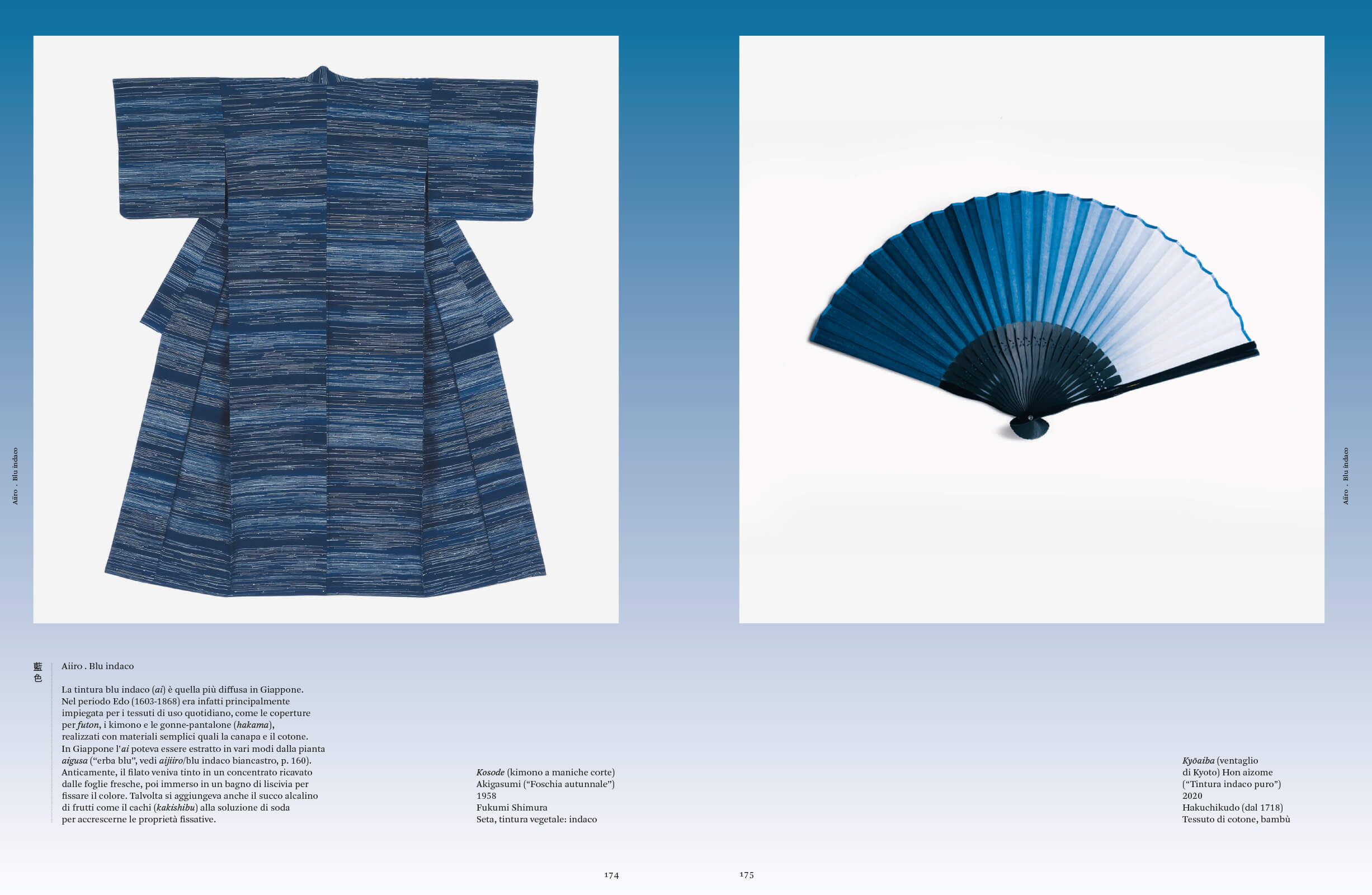
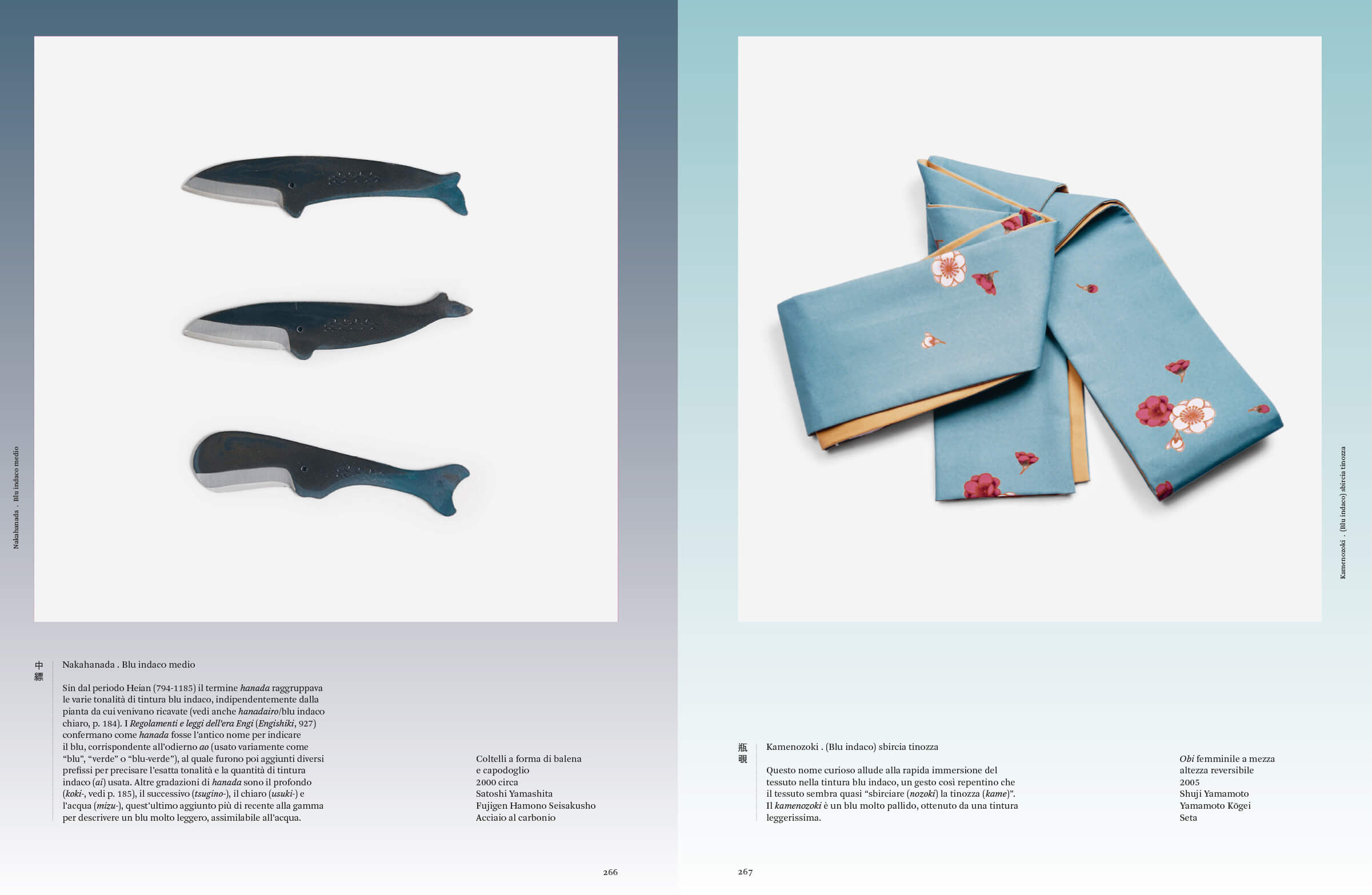
All the shades of “ai” indigo blue, from the most intense ones, defined with the “kon” character, up to the many “hanada” blues, and that light “kamenozoki” blue, which, as the name says, is the result of a tincture that has only roughly seen blue in the deepest bottom of the tub!
Which combinations would originate if you could associate a color with your literary and artistic inspirations?
The black of the “sumi” ink containing all colors of nature in endless shades of grey.
The book on your nightstand right now?
“The Lies of the Sea” by Kaho Nashiki.
Which subject that you still haven’t dealt with in a book do you dream to tell yourself?
There are only a few untold subjects, I hope I will have the chance to say something new about something that’s already been told! On color, I’m not out of words yet…
Thanks to Ippocampo Edizioni.

