Evolution is part of our essence, and fashion, influencing society and being influenced by it in turn, cannot but remain involved in this natural process.
In this field, the logo of a brand is perhaps the most important element, giving an identity to one reality and becoming a reference point for the consumer.
Even the logo, therefore, is influenced by the evolution that usually occurs alongside the change of a creative director or during a rebranding process, dividing the common opinion between those who admire the innovative aspect of it and those who would have preferred to maintain its historical value. Here, we’re going to focus on some of the changes in the logos of five luxury brands and their significance in relation to the communication strategy of these realities.
VERSACE – 5 Rebranding Logos in Fashion
Versace’s first logo was very different from the iconic Medusa we know today. Written in the Avant Garde light font, it was the name of the creator, Gianni Versace. This logo was minimal but not very easy to read because the letters were too close to each other. For this reason, the first rebranding of the logo took place in 1990, with an increase in the distance between the letters, which also got pronounced angles, and a larger space between the name Gianni and the surname Versace. However, this change lasted only three years, after which the iconic image of Medusa was added, an ancient and terrible mythological being, endowed with an aura of fascination and mystery. Gianni himself confessed that he was inspired by the ancient ruins of Reggio Calabria, where, as a child, he used to play with his sister and brother. On the other hand, Medusa is the symbol par excellence of lethal love and vanity, a curious combination for a fashion brand, almost a provocation.
Since then, there haven’t been other important changes: the Medusa symbol and the Versace inscription at the bottom remain almost unchanged, even after the tragic death of its founder whose memory is still carried on today by his sister, Donatella.
GUCCI – 5 Rebranding Logos in Fashion
The Gucci logo was designed by Aldo Gucci, one of the three sons of the founder (Guccio Gucci), who made it one of the most recognizable logos in the fashion and lifestyle scene. The first logo, however, was very different from the one we know today: it reminded the written signature of the founder and only consisted of the founder’s surname, “Gucci.” In the 1920s, many brands used a similar style – just think of the famous Walt Disney logo. Later on, for a few years, the “G” of Guccio was also added, at least until 1933, with the entry of Aldo in the company’s business.
The double G that we know so well today was his idea. In the beginning, it was juxtaposed to the Gucci inscription, but soon the latter became almost an extra, leaving room for the monogram. In 1950, after Guccio Gucci’s death, Aldo decided to pay homage to his father by adding to the logo the image of a knight carrying two bags in his hand at the center of a shield, a reference to an old 1930s logo, but it had a short life. It was only under the direction of Tom Ford that the logo with spaced and tapered letters became the official one, while, in 2015, with the arrival of Alessandro Michele, the label became white; moreover, from 2019, the designer introduced the double G oriented towards the right.
YVES SAINT LAURENT – 5 Rebranding Logos in Fashion
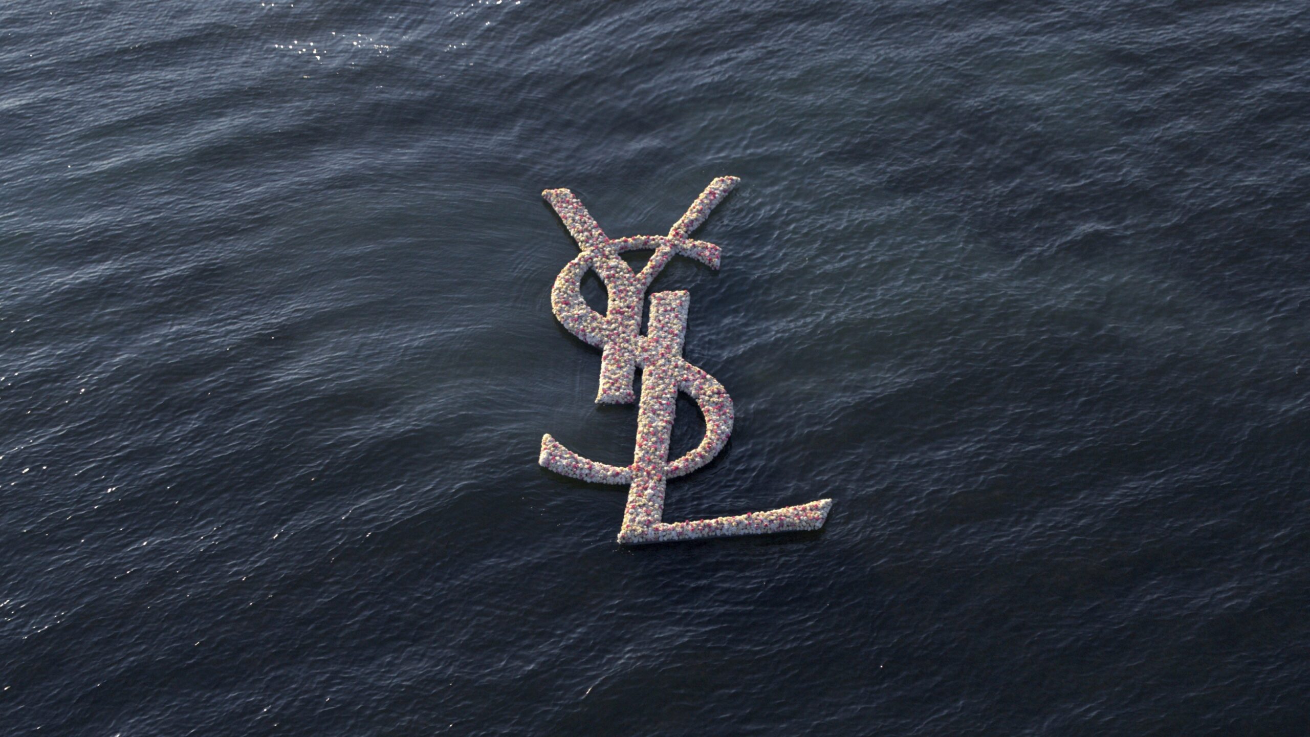
Yves Saint Laurent’s logo didn’t undergo many changes throughout its history until 2012, which was seen as quite a major shift. Entrusted to a recognized and respected Art Deco artist, Adolphe Mouron Cassandre, who was born in Ukraine and moved to France, the first logo was decidedly unconventional. A vertical monogram with the three letters of the designer’s name: Y,S,L; sharply shaped letters that created, and still create today a fluid and dynamic image.
In 2012, the creative director of the time, Hedi Slimane, decided to radically change the visual identity of the brand, arousing more than a few criticisms: the name Yves disappeared from the logo, adding “Paris” instead, under “Saint Laurent,” in homage to the city symbol of the designer. With the arrival of Anthony Vaccarello, the logo has taken on even more importance and, although used in both versions, the preference is for YSL graphics, especially for the beauty line and accessories.
BURBERRY – 5 Rebranding Logos in Fashion
It was 1901 when Burberrys was born: for its logo, a dark red color was chosen, while the image was given by a knight with shield and lance and a standard with the Latin inscription: “Prorsum,” that is “forward,” to symbolize strength, courage, and nobility. The logo, designed by Fabienne Baron, was so striking that it has remained virtually unchanged to this day. However, in the ’60s, the words became more important than the iconography of the horse, of which only a miniature remained. The inscription is in small capital letters, with the first letter capitalized and below it in block letters, but in a smaller font, the words “Of London,” a clear reference to the origins of the Maison.
In 1999 the final “s” of the logo disappeared, transforming it into what we know today as, simply, Burberry. The horse and its rider regained some details and became less stylized; the writing “Of” next to London was also removed, in a finer font. The latest version, from 2018, was much simplified, with only the Burberry name, while the iconic horse remained on the labels, in the accessories, and on the branded packaging.
FENDI – 5 Rebranding Logos in Fashion
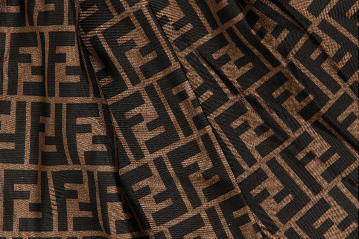
Perhaps Fendi’s most iconic logo, although no longer in use, is the double F, which however only came in 1960 with Karl Lagerfeld. The first real Fendi logo, in fact, was the image of a squirrel on a tree branch while munching on walnut with, in the lower part, the words “Fendi 1925,” the year the brand was founded. The logo, although “bizarre,” hid a very personal and intimate meaning: the founder of Fendi, Edoardo, compared his beloved wife Adele to these rodents, always snappy and considered hard workers. After the death of the founders, the company passed into the hands of the daughters, who hired as creative director one of the most famous designers in history: Karl Lagerfeld. As we’ve already mentioned, it was he who conceived the double F that remained in vogue for a long time. There are two interpretations of this: one that sees in the two Fs the will to represent the founders, Edoardo Fendi and Adele Fendi, and the other according to which the designer wanted to summarize the words “Fan Furs.”
Towards the end of the 1990s, the two F’s gave way to a simpler “Fendi” and recently, in 2013, the logo became a combination of the word Fendi and Rome, the latter positioned at the bottom. All in a soft, edgeless, and minimal font.
