A hot topic in recent years, color harmony is not only a guide to image construction but also a real discipline. In a nutshell, color harmony is the study of how colors influence and enhance a person’s appearance based on their chromatic characteristics, such as skin tone, eye color, and hair color. Dominant in the fields of fashion and makeup, color harmony also serves as a beacon in the world of filmmaking. Consider directors like Wes Anderson, Tim Burton, and Paolo Sorrentino: filmmakers whose movies we would unequivocally describe as “in palette.” In cinema, color harmony is used, whether consciously or unconsciously, to create visual coherence, express emotions, and define characters. The strategic use of colors is crucial: it can influence the audience’s perception of the story and its elements, enhance the narrative’s effectiveness, and strengthen a film’s visual identity.
The choice of specific colors in character costumes and makeup, as well as in set designs, can define not only personalities and emotional states but also the mood of the story. For instance, warm colors like red and orange suggest passion, energy, or aggression, while cool colors like blue and green convey calmness, sadness, or mystery. This is true in the general context of a big-screen story.
In essence, applying color harmony to cinema is a powerful tool: it tells a story without the need to really use words.
“The Grand Budapest Hotel” by Wes Anderson
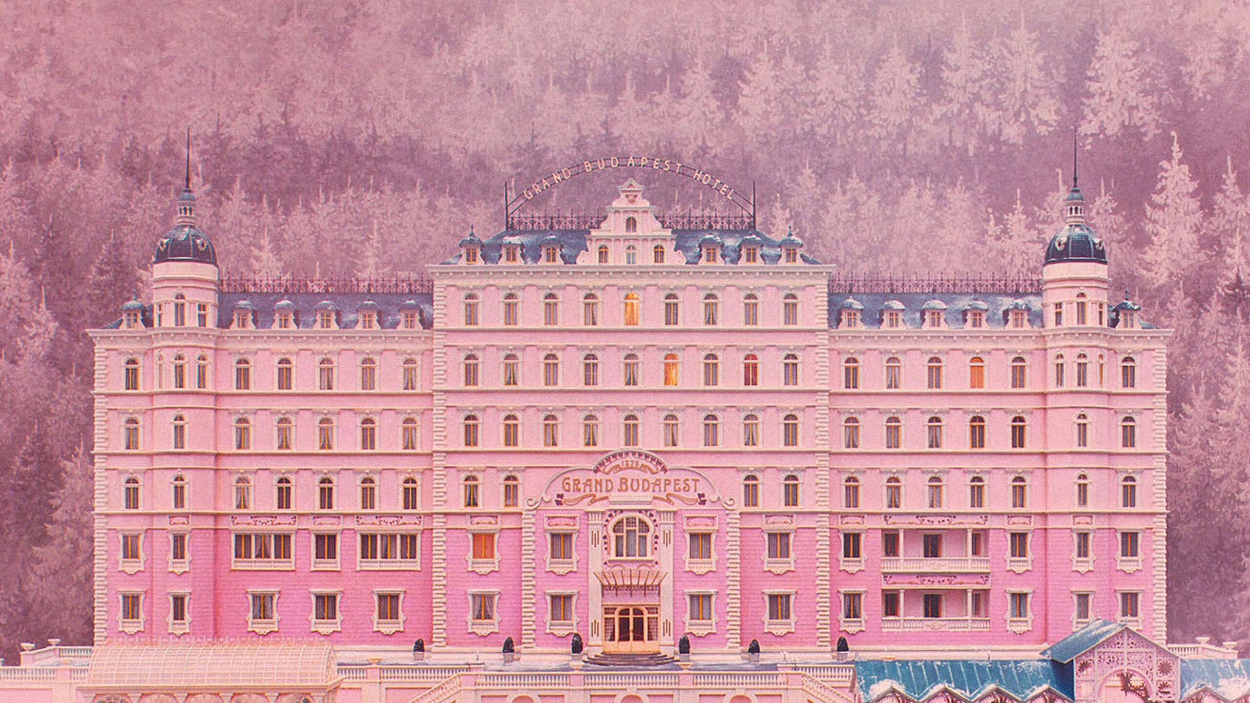
In this film, the use of pastel and vibrant colors creates a whimsical and surreal atmosphere that makes it an icon of our cinematic century. The hotel’s interiors, the characters’ costumes, and the sets are all meticulously coordinated to create a visual harmony that has become a hallmark of Wes Anderson’s style. The director is known for always choosing characteristic and harmonious color palettes for each of his films, contributing to a visually cohesive and unique world that has become his trademark.
“Mad Max: Fury Road” by George Miller
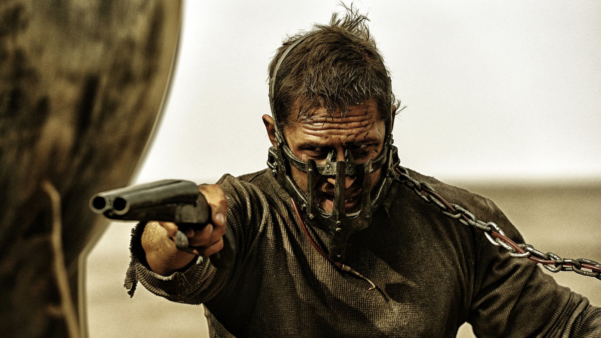
In the post-apocalyptic action movie and its recent prequel/spin-off “Furiosa: A Mad Max Saga”, the color palette is dominated by warm, sandy tones representing the desert and post-apocalyptic setting, with stark contrasts between the red/orange of the desert and the blue of the sky. This not only emphasizes the arid and hostile world in which the story unfolds but also creates a powerful visual impact that captures attention. Additionally, the use of more saturated and vibrant colors in the action sequences helps to underscore the intensity and frenzy of the scenes.
“Her” by Spike Jonze
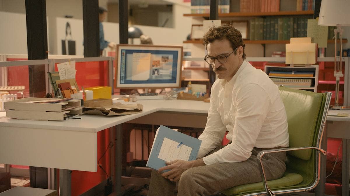
The warm and soft color palette of this film reflects the sweetness and melancholy of a futuristic love story with a real undertone. The film predominantly uses pastel shades like pink, orange, and red to evoke a sense of intimacy and warmth, portraying an idealized yet serene future in line with the love story between Theodore and the AI, Samantha. A pastel world, in essence, is a bittersweet world rendered through the right sensory nuances.
“Laurence Anyways” by Xavier Dolan
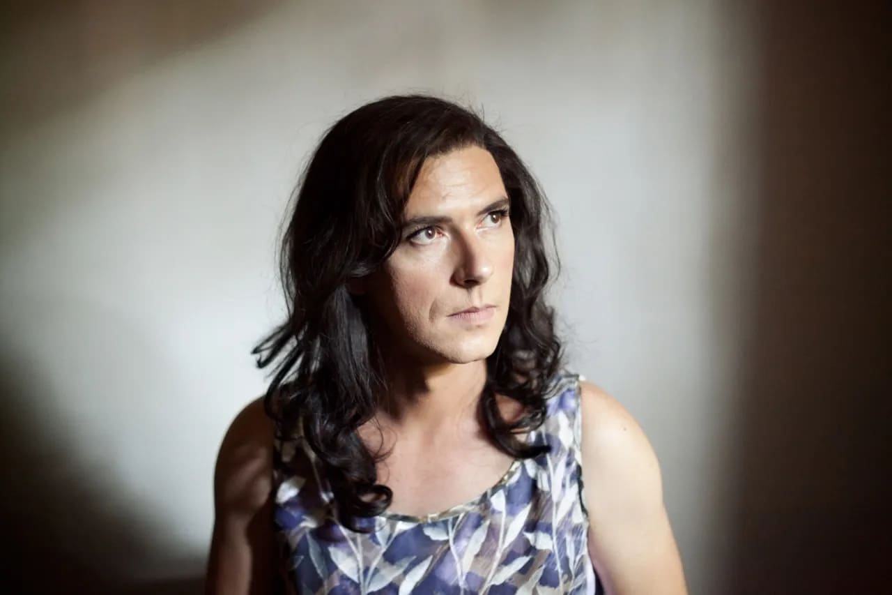
The protagonist of this story, Laurence, undergoes a gender transition: Dolan uses colors skillfully to reflect his inner journey and external transformations. Initially, the colors are quite sober and somewhat dull, but as the film progresses, they become more vibrant and varied, reflecting Laurence’s growing self-acceptance and personal liberation. Thus, in this story, the colors of costumes and sets change to represent the characters’ emotional states, with scenes of conflict or pain tinted with darker and cooler tones, and moments of joy and love colored with warm and vibrant hues. Moreover, the story is set in the 1990s, and Dolan uses a color palette that recalls this decade: pastels, typical patterns, and color combinations that help create a nostalgic and authentic atmosphere.
“Sweeney Todd: The Demon Barber of Fleet Street” by Tim Burton
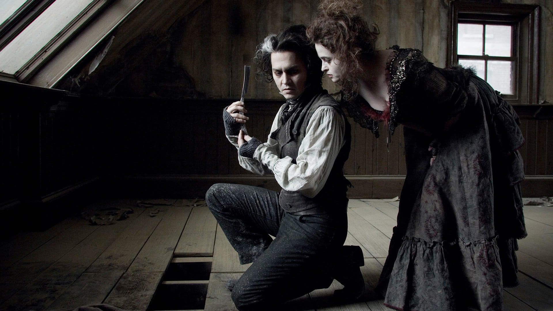
Black, white, grey, and red: death and blood for a musical horror film with a more gothic palette than ever. In this film, Burton uses a very distinctive chromatic scheme characterized by dark, desaturated, and monochromatic tones that contribute to creating a gothic and sinister atmosphere, accentuating the macabre nature of the story. The cold and dark tones, like black, grey, and dark blue, dominate the scenes, reflecting the depression and despair of the main characters, the very grim Sweeney Todd, Mrs. Lovett, and Judge Turpin.
“Marie Antoinette” by Sofia Coppola
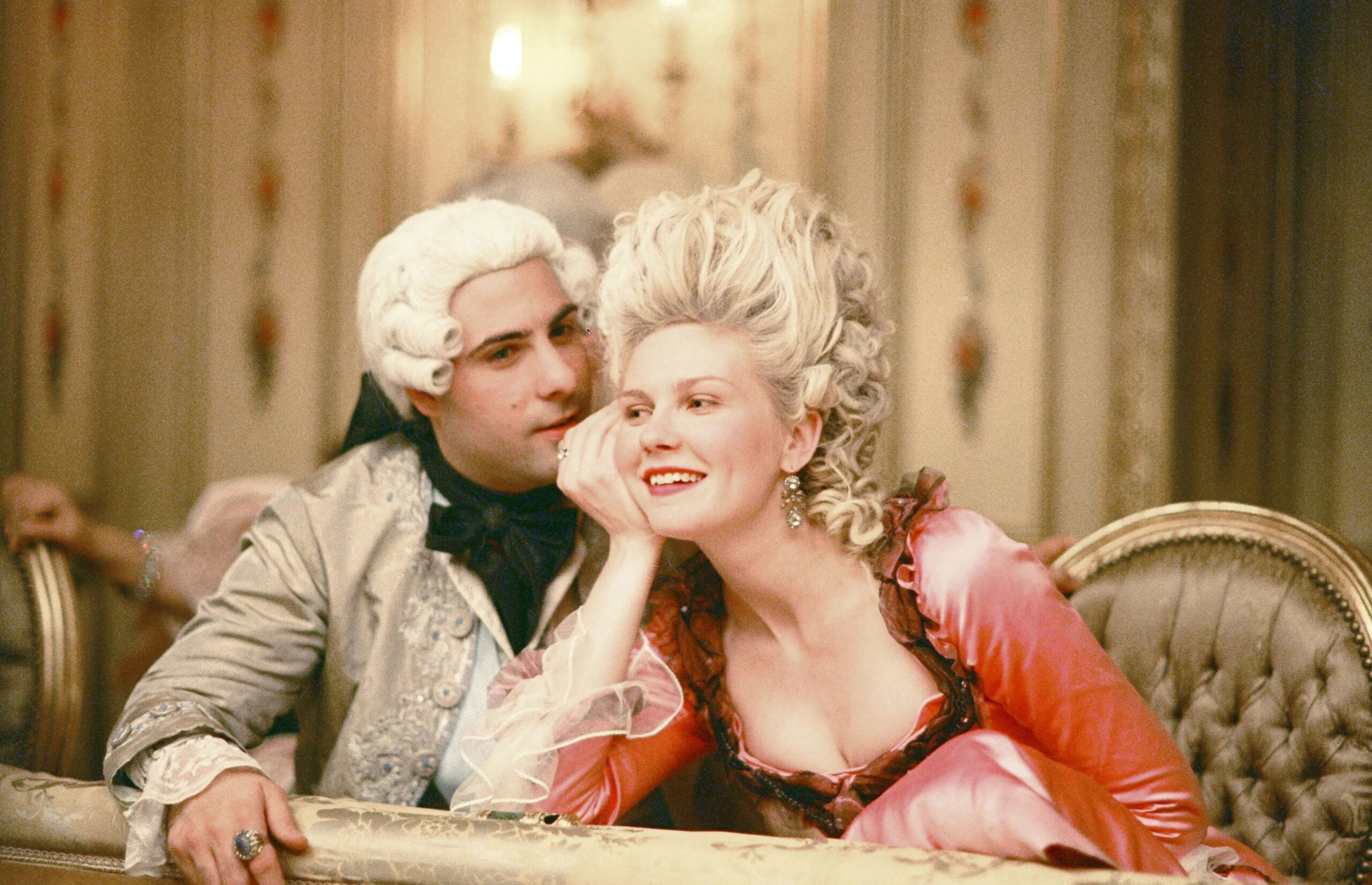
In this cult film about the Queen of France, the director used a palette of vibrant and luxurious pastel colors, such as pink, blue, and mint green, to represent the opulence and decadence of the Versailles court. The costumes, set designs, and even the food in the film contribute to creating an aesthetic that mirrors the frivolous and superficial world in which the young queen lives. The use of color harmony in this film not only enhances the visual appeal but also helps underscore the contrast between the glittering appearance of court life and the social and political pressures Marie Antoinette faces throughout her life.
“The Favorite” by Yorgos Lanthimos
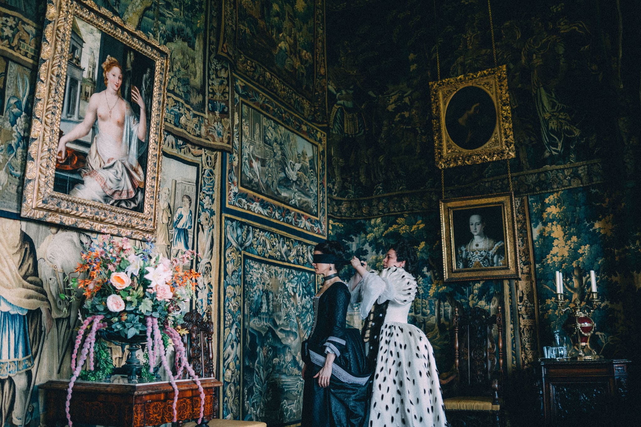
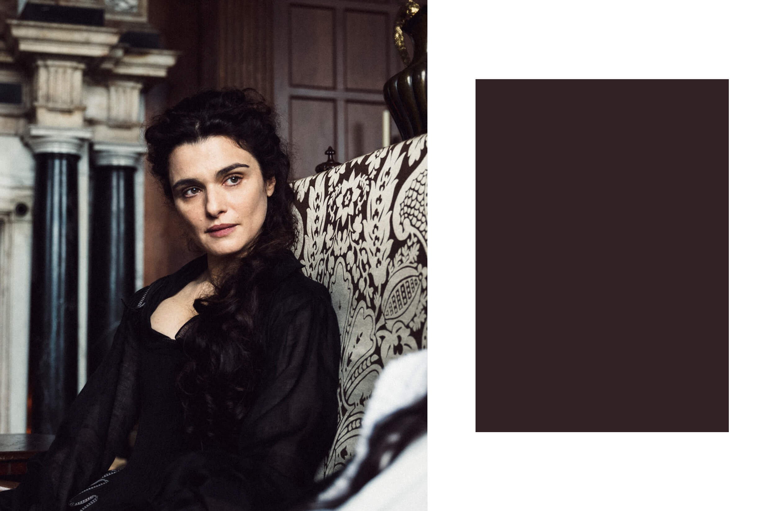
Staying with the theme of royalty, social expectations, court life, and costume dramas, in “The Favourite”, Lanthimos makes very specific use of colors in the costumes, makeup, and set design, which help to delineate the characters and create a highly recognizable atmosphere. The film, set in the 18th century, uses a unique palette for each character that reflects their social status, personality, and emotional states. For example, Queen Anne’s (Olivia Colman) costumes often include dark and rich tones that mirror her position of power and precarious health. In contrast, Sarah Churchill (Rachel Weisz) and Abigail Masham (Emma Stone) start with more muted colors, which become brighter and more vibrant as their status changes and internal conflict intensifies.
“The Shape of Water” by Guillermo Del Toro
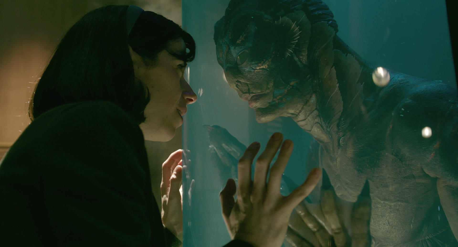
The Oscar-winning film of 2018 uses a predominantly cool color palette, such as aqua green, blue, and grey, reflecting the aquatic setting and emphasizing the sense of mystery and magic that dominates the film. Warm colors like red and yellow, on the other hand, are used to create contrast and highlight moments of passion, danger, or humanity. For example, red is often associated with love and vitality, breaking the predominance of cool tones. The use of color harmony in this film helps create a dreamlike and surreal atmosphere, which is also a stylistic hallmark of the director.
“Annette” by Leos Carax
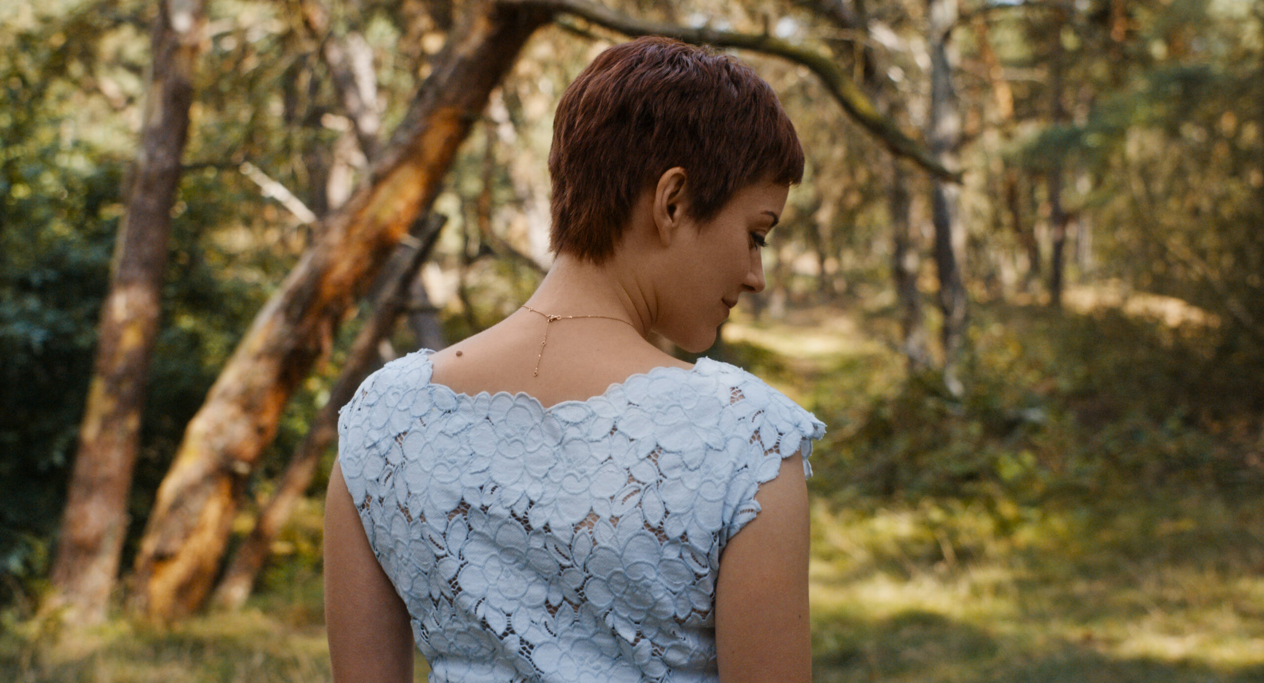
In this romantic and surreal musical, colors are used strategically to highlight moments of tension and drama between the protagonists, Ann (Marion Cotillard) and Henry (Adam Driver). Specific palettes are associated with each character: Ann is often linked to warm and bright tones that reflect her career as an opera singer and her radiant personality, while Henry is tied to darker and gloomier colors that represent his comedic yet slightly unsettling side. As in Dolan’s work, here the chromatic changes accompany the emotional and narrative transformations, emphasizing the characters’ evolution and the plot’s progression: palette choices that help create a unique and immersive atmosphere, enhancing the dreamy and tragic tone of the story.

